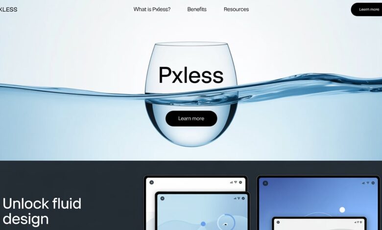
Pxless is a design mindset where you stop locking things to fixed pixels. Instead, you let sizes flow. You use flexible units like %, em, rem, vw, and vh. Your layout stretches and shrinks with the screen. It feels natural, because it is.
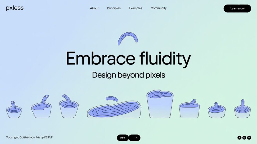
Think of it like water in a glass. The glass can be tall, wide, or tiny. Water just takes the shape. Pxless helps your page do the same. No more stuck boxes. No more cut-off text. No more “why does this look broken on my phone?” moments.
Why pxless matters in 2025
People use many screens now. Phones, tablets, laptops, big monitors, even TVs. They also zoom a lot. A pixel-locked layout can break fast. Pxless helps your design adapt. It works well when someone zooms in. It works well when fonts are larger by default. It works well when a device is very narrow or very wide.
Search and speed matter too. A pxless layout often needs fewer one-off fixes. That can mean cleaner CSS and fewer layout jumps. Sites feel faster and more stable. That helps real users and core web metrics. In short: pxless can be good for people and for SEO at the same time.
How pxless works (without the stress)
First, you use flexible units. For text, rem is a great default. It scales with the root font size. For widths, % and vw are your friends. For heights, vh can help, but use it with care on mobile browser chrome. Images should get max-width: 100% and height: auto. That one line stops a lot of overflow pain.
Next, you rely on modern layout tools. Flexbox makes rows and columns that bend. CSS Grid gives you smart tracks that grow and shrink. You can also use clamp() to set safe, fluid ranges. For example, clamp(1rem, 2vw + 0.5rem, 1.5rem) lets a heading grow on big screens and stay readable on small ones. It is one line, and it feels like magic.
A tiny story: pixels vs. people
A shop owner wrote to a developer: “My site looks perfect on my laptop. But my customers on phones see a mess.” The site used fixed px for everything. Buttons were too small. Cards overflowed. The header covered half the screen. The developer switched to pxless. They used rem for text, % for widths, and Grid for the product list. They also added clamp() to headlines. In one week, bounce rate dropped, and sales went up. Same content. Better layout.
This is common. We often design on big screens. But real people live on small ones. Pxless puts people first. It helps you ask better questions: “What if someone zooms?” “What if the phone is in landscape?” “What if the user sets large text?” With pxless, the site says, “That’s fine. I can adjust.”
Common worries (and simple answers)
“I’ll lose control.” You won’t. You trade rigid control for guided control. You still set rails with min and max sizes. You still pick a scale. Pxless is structure with room to breathe, not chaos.
“Legacy browsers will fail.” Most core pieces of pxless work in all modern browsers today. Flexbox and Grid are widely supported. clamp() has broad support too. If you must, you can set safe fallbacks. Start with the flexible path, then layer fallbacks only where needed.
The building blocks you’ll use most
Start with type. Use a base font-size on html or :root. Scale everything else with rem. Set comfortable line lengths using ch units or fluid max widths. Your paragraphs will read better right away.
Then shape the page. Use Grid for main areas: header, content, sidebar, footer. Let tracks be minmax() ranges. Use Flexbox inside cards and nav bars. Set media queries only for real jumps, not every 50 pixels. Pxless means fewer breakpoints, not more.
Accessibility and pxless go hand in hand
Many users need larger text or higher zoom. Fixed pixels fight that. Pxless welcomes it. When text grows, the layout makes space. Buttons stay usable. Forms do not burst out of their boxes. This is not only kind; in many regions, it is also part of meeting accessibility rules.
Also think about input. Fingers need room. Use rem or em to size targets, not small pixel values. When the base size grows, tap targets grow too. That makes mobile use feel calm and clear.
Quick checks you can do today
Open your site. Set your browser zoom to 125%, then 150%. Does anything overlap? Do lines get too long or too short? If yes, pxless changes will help. Now, pull the window very narrow, then very wide. Watch images and cards. If they snap or overflow, switch widths to % or vw, and cap with max-width.
Try a simple headline test. Replace a fixed font-size: 24px; with font-size: clamp(1.25rem, 2vw + 0.5rem, 1.75rem);. Check three screens: phone, tablet, desktop. You will see a smooth scale. One rule. Many wins.
A quick note: pxless vs. Pixxles
You may also see “Pixxles” online. That is a UK payments company that provides online payment processing and related tools. It is not the same as pxless. The spelling is close, so it is easy to mix them up. When we say pxless here, we mean the flexible web design approach, not the payments brand.
Why mention this? Because people search with typos. If you work on content, you may want to clarify this in your FAQs. A short line like “Not to be confused with Pixxles (payments)” can save readers time and reduce support emails.
Building your own pxless layout
Let’s make it real. You don’t need to rebuild your site to start using pxless ideas. You can begin small. Try one section — maybe your homepage or a simple landing page.
Start with the container. Instead of a fixed width like 1200px, try max-width: 90vw and margin: 0 auto;. It will center your layout and shrink neatly on smaller screens. Then move to text. Set font-size: 1rem for body and use clamp() for headings. You’ll see instant balance across devices.
Add images that flow. Give them max-width: 100%; height: auto; so they stay in proportion. Combine that with a Grid layout that uses flexible tracks like 1fr and minmax(). Suddenly, your site will feel alive. It will adjust like it understands your visitors.
A simple pxless pattern you can copy
Here’s a small example:
:root {
  --space: clamp(1rem, 2vw, 2rem);
}

body {
  font-size: 1rem;
  margin: var(--space);
}

h1 {
  font-size: clamp(1.5rem, 3vw + 1rem, 3rem);
}

.container {
  display: grid;
  grid-template-columns: repeat(auto-fit, minmax(15rem, 1fr));
  gap: var(--space);
}

img {
  max-width: 100%;
  height: auto;
  border-radius: 0.5rem;
}
That small block makes a page that scales gracefully. No fixed pixels. Just fluid, natural design. You can see how each part respects space and size without breaking.
Common traps (and how to fix them)
Trap 1: Mixing px with fluid units.
If you mix px and rem, you lose the benefit. Try to stay consistent. Convert all margins and paddings to rem or %.
Trap 2: Forgetting limits.
Sometimes, flexible units grow too much on giant screens. That’s why clamp() is perfect. It keeps things comfortable with a top and bottom range.
Trap 3: Too many media queries.
Pxless works best when you rely less on breakpoints. Let the layout breathe. Only add queries for real layout jumps, not every device.
Trap 4: Ignoring text flow.
Don’t fix line heights or block widths. Use max-width: 60ch; for paragraphs to keep reading easy.
These small habits will make your pxless journey smoother.
Testing your pxless site
You don’t need fancy tools. Just open your browser and resize the window. Watch how your layout reacts. If it stays clean, you’re on track.
Use mobile simulation in Chrome or Safari. Check zooming and font scaling. Does your site still feel right? If it does, that’s pxless working.
Ask friends to open your site on different phones. You’ll see how freeing it feels when everything looks right everywhere.
Why pxless is the future of design
We live in a time where screens change fast. Smartwatches, foldable phones, tablets, huge displays — the list keeps growing. Pxless design prepares you for all of it. You don’t have to chase every new resolution. Your site will already know how to adjust.
It also saves time. Once you think pxless, you build fewer patches and fixes. You can focus on your content and your users. Your site feels smoother and more human.
And it’s kind to everyone. Whether someone uses zoom, a screen reader, or a small phone, pxless design gives them a fair and friendly experience. That’s the heart of good web design.
Wrapping it all up
Pxless is not just a style — it’s a smarter way to build for today. It helps your design breathe, grow, and adjust without breaking. It’s simple, modern, and kind to every device.
So next time you start a project, ask: Can this be pxless?
If the answer is yes — start small, stay flexible, and enjoy the flow.
Your site will thank you. Your visitors will too.